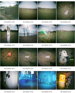
Here are the Contacts:
I also shot 3 Rolls of colour film, i chose to shoot both because I love the colours when using a Holga and need to decide on which one I am going to use for the whoel project. The first film I shot was already in the camera so it was a waste and there are some really stupid and random shots. I tried to practice with the flash a in a few, and the majority of them were shot using the normal flash but I tried the different colours as well - and I was shocked to see how vibrant the colours were.
I definitley prefer the second colour contact sheet as I think some of these shots are a little bit stronger apart from the ones with the blue flash! When I was looking at the black and white contact prints it reminded me of pinhole portraiture photography - so that is another area for me to explore using my Diana+ camera - I have it so I may as well try and use it properly. I really want to explore the multiple exposures more and realting it to the little bit of research with the ghostly figures - but I am finding it difficult for people to shoot as when I am available they are at work, I need to decide ASAP where I am going with this project. Oh, there is so much for me to do, by next week I hope to have 3 more films to show, with a definite process in mind and can start to produce more work and hopefully start selecting some final prints!
Adios Amigos!!


You know my views on colour v b&w on holga already. I say go colour as I think the results will be more exciting. I'm sure it's possible to get good b&w but I reckon the hit rate will be v low compared to colour. There is something about the combination of that plastic lens and colour film that is magical - I think it's the washed out softness I love. It gives you much more scope as well in subject matter.
ReplyDeleteHaving said that the chair in b&w looks good - it may be because the light is good and you've got shadow. I found it hard to get any contrast with b&w - all my stuff looked grey. Whichever way you go you definitely need to go out on a bright day - it needs the contrast.
Oh & I'm with you on big printing. I want to ban dust & the causes of dust for evermore.
is nice to see some colour holga stuff... i havent used it yet and it gives me a good idea of what to expect. You've obviously got the knack for the holga as you actually HAVE pictures on your films... perhaps i need some tips lol
ReplyDeletea good start, you have some pretty interesting images. I love how the holga looks, and how it can transform subjects to make them look a lot more exciting. I also think you should go down the colour route, as the images are stronger. You just need to confirm your subject matter now, and it should all work out nicely!
ReplyDeleteI like these images but i think they are a bit green, you need a bold colour in these shots to really bring them to life. Remember kayleighs project where she took out a green chair and shot a load of holga images? That was good as each image has a repeated theme in it? Maybe go down that route - random objects in odd places??
ReplyDelete